


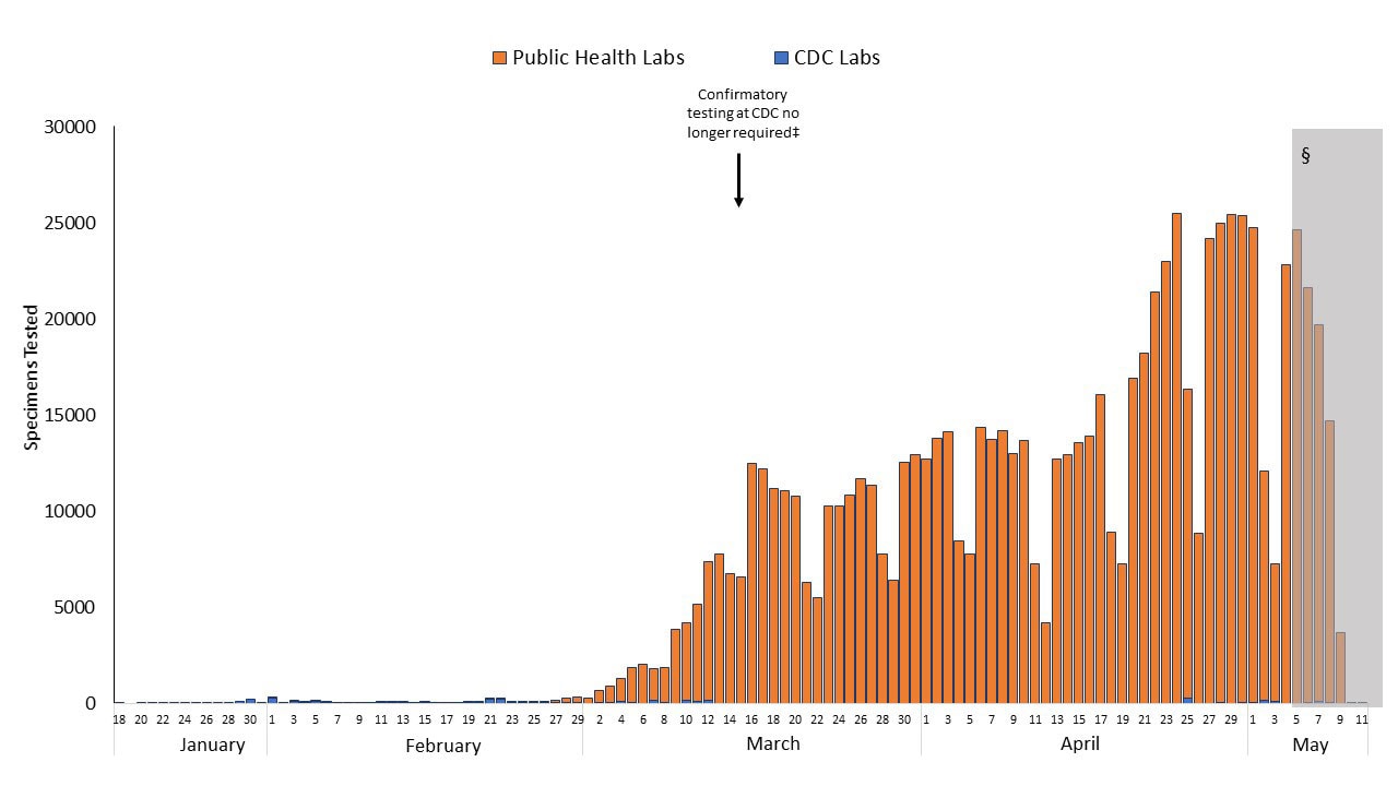
i'm not sure these data capture all the tests because the number of new cases in recent days has far exceeded these test numbers...but the graph might still give an somewhat accurate picture of trends in testing prevalence...the data in the shaded area are incomplete due to lags in reporting

 Reply With Quote


