Tapate50
Well-known member
All he is told in his echo chamber is that people with money are bad. What do you expect?
LOLGOP
All he is told in his echo chamber is that people with money are bad. What do you expect?
57, what do you believe is the healthier situation. The graph from 1979 or the graph from 2014?
Just answer that and we'll go from there
i don't think people with money are bad
if that comment was directed at me
and the models of stock prices were going along with expected growth
which it was
just like i said i'm not shocked prices have gone up with people in charge who don't care about anything at all as long as more money can be made as if they can eat and breath money
but you guys have your talking points that ya stick to
got me!learn how to post a picture
i believe the quote posted said "gutted" rather than wiped out.
Where "gutted" implies dying from the inside out and wiped out means, "wiped out"
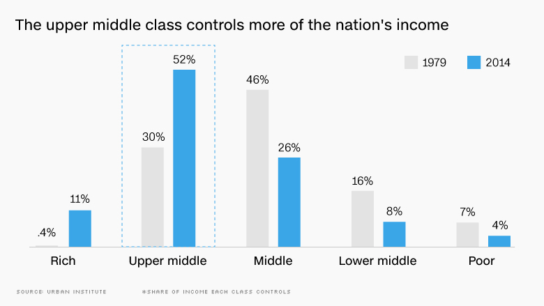
Your own graphs and numbers show a wealth distribution heading to the upper middle and rich classes
and a shrinking of the middle and lower middle.
There is a segment of society that is benefiting from 1980's on policies, but it is not the majority middle classes
Not sure what else there is to say.
..............
Are there less aggregate poor people as a percentage of total population?
Are there less lower middle class people as a percentage of total population?
Are there less middle class people as a percentage of total population?
hmmmmm
Let's look here.
In 1979, the lower-middle and poor made up 23% of people. That number has since shrunk to 12%!
Meanwhile, the middle, upper-middle, and rich has grown from 76.4% in 1979 to 89% today.
I know math is hard... but I'm seeing more people in the middle class, and less people in the poor. It just so happens we're graduating more and more people above than below.
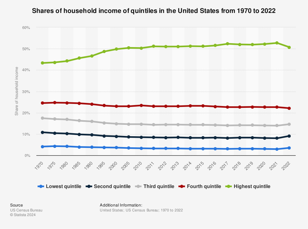
I hesitate to wade in this cesspool, but everyone needs to read the legend in the graph sturg33 posted. It's not the percent of the population in each class. It's the percent of income held by each class. I don't know if it's divided by quintiles or quartiles, but it appears to provide a description of where income is situated, not where individual groups of taxpayers are situated. Plus, the source is the Urban Institute, which has been attacking inequality for years so I highly doubt they would put something together that would undercut their argument. Here's a different graph that shows how income is distributed by quintiles. You can see it has been going up for the top quintile and dropping for all quintiles bellow that.
This is the sort of potential "good story" spectacle I imagined, when I mentioned being given pause in the rush to heap adulation on corporations for handing out bonuses "in response" to the tax bill:
[tw]944612596237389824[/tw]
PR is fun
I hesitate to wade in this cesspool, but everyone needs to read the legend in the graph sturg33 posted. It's not the percent of the population in each class. It's the percent of income held by each class. I don't know if it's divided by quintiles or quartiles, but it appears to provide a description of where income is situated, not where individual groups of taxpayers are situated. Plus, the source is the Urban Institute, which has been attacking inequality for years so I highly doubt they would put something together that would undercut their argument. Here's a different graph that shows how income is distributed by quintiles. You can see it has been going up for the top quintile and dropping for all quintiles bellow that.
Reading is no picnic, either.
50 - thanks for the helpful clarification and for providing substance to an argument that 57 was incapable of doing. This is helpful and I definitely did not see the fine print.
But let's address the graph you posted. I think the goal of any society should be to move people up in classes, right?
So, by the logic, we want to move people out of the 1st and 2nd quintile, up to the 3rd, 4th, and 5th quintile.
In 1970, the lowest and 2nd quintile made up 14.9% of people.
Today, that number is 11.3%.
That looks like a substantial improvement of moving people towards the middle class, no?
Now, in 1970, the 3rd, 4th and highest quintile made up 85.2%. Today, that is now 88.6%.
By any metric, the lives of Americans in this country is better than it was in 1970.
So let's go back to LOLGOP's tweet... how can we look at this and say the middle class has been gutted? When the reason for that is people advancing to the next class? Do we not want that in this country?
Qunitile is total population divided by 5. The graph I posted shows that the share of income in the top quintile (top 20%) has improved and for all other quintiles it has dropped. People move in and out of quintitles (for every unit that moves to a higher quintile, a unit has to move down), but the income seems to be moving up and staying steady or declining slightly for everyone else (in real terms). I can't comment as to whether or not things are better than they were in the 1970s or not. Apples and oranges and a vast movement of the population from rural areas to the suburbs and exurbs.